Crypto trading live chart: how to read real-time market data with discipline

Key Takeaways
A live chart is a record of changing market information, not a prediction machine. We read it best by combining price structure, volume, timeframe, execution details and disciplined risk controls.
- A chart shows price movement, volume and market activity from a chosen market and timeframe.
- Candlesticks organize open, high, low and close data into readable visual units.
- Multiple timeframes help us separate short-term noise from broader market structure.
- Indicators add context but do not replace judgment, liquidity awareness or research.
- Responsible chart reading means observing first, recording assumptions and controlling risk.
What a crypto trading live chart shows
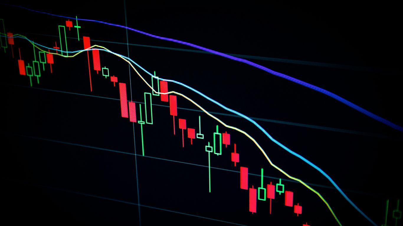
A crypto trading live chart presents market information as it changes. Depending on the venue and instrument, we may see price, volume, recent trades, order-book information and selected indicators in one interface. The central task is not to react to every movement. It is to understand what the display measures, what it leaves out and how quickly the information can become outdated.
We should also distinguish a chart from an execution record. A chart summarizes transactions or quoted prices over time, while an order creates an instruction that may be filled under different conditions. That distinction becomes especially important during fast markets.
Price, volume, and market activity
Price tells us where transactions or quotations are occurring, while volume describes how much trading took place during a period. Neither measure is complete on its own. A rising price with modest volume may communicate something different from a similar move accompanied by unusually active trading.
For broader market context, we can compare the chart with live market metrics, including market capitalization and reported trading volume. We should still check the source, timestamp, market pair and calculation method before treating any figure as directly comparable.
Candlesticks and the information they contain
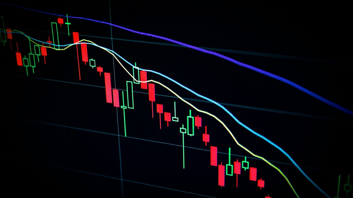
A candlestick compresses activity during a selected interval into a body and one or two wicks. The body shows the relationship between the opening and closing prices, while the wicks show the highest and lowest recorded prices in that interval. A single candle is therefore a small summary of a sequence of transactions, not a complete explanation of why the market moved.
The meaning of a candle depends on its location and its surrounding candles. A long lower wick near a previously observed price area may attract attention, but it does not establish that buyers will defend that level again.
Bid, ask, spread, and order-book depth
The bid is the highest displayed price a buyer is offering, and the ask is the lowest displayed price a seller is offering. The spread is the difference between them. An order book also shows displayed quantities at different prices, although those quantities can change or disappear before an order is filled.
Depth is best treated as a current observation rather than a promise of available liquidity. A narrow spread may make a market appear easier to enter or exit, while thin depth can allow a relatively modest order to move the quoted price more noticeably.
Why live data can change rapidly
Crypto markets operate across many venues and react to news, positioning, liquidity and changing expectations. A live feed can update several times while we are still interpreting the preceding move. Delays, aggregation methods and differences between market pairs can also produce slightly different readings.
For that reason, we should record the timestamp and venue whenever we study a chart. Current crypto prices can be useful for orientation, but a reference page is not automatically the same as the order book where an eventual transaction would occur.
How to read candlestick charts
Candlesticks become useful when we read them as evidence within a sequence. We first identify the interval, then compare the candle with nearby price action, volume and previously observed reference points. This approach helps us avoid assigning too much meaning to an attractive shape in isolation.
We can also use a clean chart with limited annotations. Too many lines and signals make it harder to distinguish an observation from an interpretation. The aim is a repeatable reading process rather than a visually complicated one.
Open, high, low, and close prices
Every completed candle contains four basic values: open, high, low and close. If the close is above the open, charting conventions usually display a bullish candle. If it is below, the candle is usually bearish. The size of the body and the length of the wicks show how far price traveled and where it finished relative to the interval.
An unfinished live candle deserves extra caution because its high, low and close can still change. We should not treat a pattern as confirmed while the interval remains open.
Bullish and bearish candle formations
Bullish and bearish formations describe short-term relationships between opening and closing prices, rejection of a price area or changes in momentum. Examples include engulfing formations, doji candles and long-wick candles. Their reliability depends on context, including trend, volume, liquidity and the timeframe being examined.
A formation is an observation, not an instruction. Context matters more than shape because the same candle can carry different implications near a range boundary, after an extended move or in a thin market.
Support and resistance as market reference points
Support and resistance are commonly used as reference areas where price has previously encountered buying or selling interest. They are zones rather than perfectly precise lines. A level may be crossed briefly, revisited later or rendered less relevant as new information enters the market.
We can mark prior highs, lows, consolidation areas and repeated turning points, then ask whether current activity confirms or challenges those observations. This keeps the analysis descriptive instead of turning every line into a forecast.
Common chart patterns and their limitations
Triangles, ranges, channels and head-and-shoulders formations are visual descriptions of recurring arrangements. They can help us communicate structure, especially when several traders are watching the same area. Yet pattern recognition is vulnerable to hindsight and selective attention.
We should test a pattern against volume, timeframe and invalidation conditions rather than assume that its historical label determines the next move. Educational material such as Crypto Millionaire In The Making may introduce chart reading and risk management, but no course or pattern removes uncertainty from markets.
Choosing the right chart timeframe
Timeframe selection changes the story we see. A one-minute chart emphasizes individual transactions and short bursts of activity, while a weekly chart compresses those movements into a broader record. Neither is inherently more truthful. Each answers a different question.
We should choose the interval before interpreting the chart and keep it consistent while comparing observations. Moving between timeframes only to find a preferred signal can turn analysis into confirmation seeking.
Short-term intervals and market noise
Short intervals show detail, but they also contain more random movement, spread effects and temporary order-book changes. Small candles can look significant when enlarged on a screen. That visual prominence does not mean the underlying move has structural importance.
If we study a short interval, we should define what it is meant to show, such as execution conditions or immediate range behavior. It should not automatically be used to describe a market cycle.
Medium-term views for broader context
Medium-term charts can make trends, ranges and repeated tests of price areas easier to see. They often provide a useful bridge between immediate market activity and longer-term structure. Volume and closing prices remain essential because a smooth-looking line can conceal sharp intraperiod movement.
A medium-term view is still only a sample of market history. We should compare it with the reason we are studying the chart, rather than treating its direction as a standalone conclusion.
Long-term charts and market cycles
Long-term charts help us observe phases of expansion, contraction, consolidation and changing participation. They are particularly useful for understanding how quickly a market can move from confidence to caution. They cannot tell us when a cycle will change.
Long-horizon analysis also encourages patience with incomplete information. Strong infrastructure and transparent records matter more when markets are judged across full cycles rather than isolated sessions.
Comparing multiple timeframes without overinterpreting them
A practical comparison begins with one broad timeframe, then moves toward more detailed intervals. We can use a simple framework to keep each view assigned to a distinct question:
| Timeframe view | Main question | Common limitation |
|---|---|---|
| Short term | What is happening immediately? | High noise and rapid reversals |
| Medium term | Is a range or trend developing? | Context may still be incomplete |
| Long term | What market phase is visible? | Signals arrive slowly |
After reviewing the table, we can ask whether the views agree on structure or merely describe different scales. Agreement can improve clarity, but it does not guarantee an outcome.
Using indicators with a live crypto chart
Indicators are mathematical transformations of price, volume or both. They can organize information that is difficult to compare by eye, but they remain dependent on historical inputs. A live indicator may change as the current candle develops, just as the underlying price does.
We should use a small number of indicators with clearly defined purposes. A chart that displays every available tool often creates the appearance of precision without improving the quality of the underlying observation.
Moving averages for trend context
A moving average smooths past prices over a chosen number of periods. It can help us describe whether recent prices are generally above or below a reference path and whether the path is rising, falling or flat. Different settings respond at different speeds, so a moving average is not a universal trend definition.
Crossovers may be visually convenient, but they are derived from past data and can arrive after a move has already begun. We should interpret them alongside price structure and the selected timeframe.
Relative strength index and momentum
The relative strength index, or RSI, compares recent upward and downward price changes to produce a bounded momentum reading. High or low readings can indicate strong recent movement, but they do not by themselves prove that price must reverse. In a sustained trend, an indicator can remain near an extreme for longer than expected.
We should ask what the RSI adds to the chart. If it merely repeats an obvious move without clarifying momentum or divergence, removing it may make the analysis cleaner.
Volume indicators and confirmation
Volume indicators help us compare the intensity of activity across intervals. A price break accompanied by greater activity may appear more consequential than a move through the same area on unusually low volume. This is a comparison, not a guarantee of continuation.
A useful research habit is to compare chart readings with crypto market news and trends, then separate the reported event from our interpretation of its possible market effect. News can explain attention without proving causation.
Why indicators should not be used in isolation
Indicators lag, rely on selected inputs and can produce conflicting readings. They also do not show every factor that affects execution, such as hidden liquidity, account constraints or a sudden change in the order book. Their proper role is to support a stated observation.
When several indicators disagree, we should not add more indicators simply to force agreement. Returning to price, volume, timeframe and market conditions is usually more informative.
Understanding volatility and market structure
Volatility describes the extent and speed of price variation. Market structure describes how prices form ranges, trends, breaks and tests across time. These concepts overlap, but they are not identical: a market can be volatile within a stable range, or move steadily while liquidity remains strong.
A disciplined reading also considers the conditions beneath the chart. Stability is not the absence of movement. It is the ability to understand movement without allowing every fluctuation to dictate our decisions.
How liquidity affects price movement
Liquidity refers broadly to the availability of trading interest near the current price and the ease of completing transactions without a large price impact. Deeper displayed interest can absorb orders more readily, while thinner conditions can produce larger changes from smaller transactions.
Liquidity varies by asset, venue, time and market event. We should therefore avoid assuming that a chart pattern will behave the same way in every market.
Volatility during major market events
Announcements, economic data, network developments and unexpected operational events can change participation quickly. The first price response may be wide and disorderly as participants revise expectations. Later activity may either confirm the initial direction or retrace it.
The most useful question is often structural: what changed in liquidity, positioning or information? A calm process helps us distinguish a new market condition from an emotional reaction to a headline.
Gaps, slippage, and fast-moving markets
A gap is a discontinuity between successive quoted or traded prices. Slippage is the difference between the expected execution price and the actual fill price. Both become more relevant when prices move quickly, depth is limited or an order is large relative to available interest.
We can reduce confusion by checking the order type, displayed spread, market depth and timestamp. A charted last price is not a promise that every participant could have transacted there.
The difference between correlation and causation
Two variables can move together without one causing the other. For example, a price change and a news event may occur in the same interval, while broader risk sentiment, liquidity or positioning also contributed. Charts reveal timing and association more readily than they reveal causation.
We should state explanations cautiously and identify what evidence would support or challenge them. That standard is useful whether we are reviewing real-time crypto prices or a longer historical series.
Connecting chart analysis with exchange execution
Chart analysis becomes practical only when we understand how an exchange turns an instruction into a fill. The displayed price, order type, fees, market depth and instrument design all affect the result. A correct reading of a chart can still lead to an unexpected outcome if execution mechanics are ignored.
This is why transparency is foundational. We should know what a venue displays, how it calculates charges and which risks are specific to spot or derivatives trading before using the interface.
Market orders and limit orders
A market order prioritizes execution at available prices, while a limit order specifies a price condition. A market order may fill across multiple levels when depth is limited. A limit order may receive a partial fill or remain unfilled if the market does not reach its price.
Neither order type is universally superior. The appropriate educational question is whether we are prioritizing immediacy, price control or a clearly defined combination of both.
How fees affect transaction outcomes
Fees reduce the amount received or increase the cost of a completed transaction. We should include them when comparing a chart observation with an account result, especially when the intended price movement is small. Withdrawal charges and network conditions may also matter when assets are moved away from a venue.
Bitval publishes clearly disclosed fee structures, with spot trading using a maker and taker model. Its stated spot maker fee is 0.12% and taker fee is 0.145%, while fees reflect investment in security, compliance and infrastructure rather than a race to the lowest price.
Spot trading versus perpetual futures
Spot trading involves the exchange of assets, while perpetual futures are derivative contracts designed to track an underlying market without a fixed expiry. The two instruments can show related price action but have different settlement, margin and liquidation considerations.
Bitval offers spot and futures trading, so readers comparing instruments should study the specific contract terms and risk disclosures before using either market. The presence of an instrument does not make it suitable for every participant.
Funding fees and leverage-related risk
Funding fees are periodic payments between long and short positions intended to help keep a perpetual futures price aligned with spot. The amount depends on position value and the funding rate. Leverage increases the sensitivity of an account to price movement and can make losses develop quickly.
We should treat leverage as an additional risk factor, not as a shortcut around limited capital. A chart does not display the full effect of margin requirements, funding payments or liquidation rules.
Building a responsible chart-reading process
A responsible process turns a live chart into a record of observations rather than a trigger for impulse. We begin by identifying the market, venue, timeframe and data source. We then describe what is visible before deciding whether any further action is justified.
This approach supports both beginners and experienced participants because it emphasizes repeatability. Security, transparency and operational discipline matter alongside technical interpretation, particularly when market conditions become difficult.
Defining an observation before taking action
We can write one neutral sentence before changing an order or position. For example, we might record that price is testing a prior range boundary while volume is above its recent average. The sentence should describe evidence, not predict an outcome.
A useful observation process includes:
- Naming the asset, market pair and venue.
- Recording the timeframe and timestamp.
- Describing price, volume and nearby reference areas.
- Stating what would make the interpretation less convincing.
After this step, we can decide whether more research is needed. The discipline lies in separating what the chart shows from what we hope it will show.
Recording assumptions and reviewing outcomes
A short journal can include the original observation, the reason for studying it and the conditions that would invalidate it. We can later compare the record with what actually occurred, without rewriting the original reasoning after the fact.
Reviewing outcomes is not about proving that every decision was correct. It is about identifying recurring errors such as changing timeframes mid-analysis, ignoring fees or mistaking correlation for causation.
Using risk controls and avoiding impulsive decisions
Risk controls should be defined before pressure rises. They may include position sizing limits, price alerts, order-size checks, account safeguards and a decision to remain inactive when information is unclear. The specific control depends on the instrument, venue and individual circumstances.
We should also protect attention. Constantly watching a live chart can encourage unnecessary reactions, especially when short-term intervals magnify ordinary movement. Stability over speed is a useful principle for both market analysis and platform design.
Separating market education from financial advice
Chart reading is an educational skill, not a guarantee of profit or a substitute for personal research. We should evaluate the source of data, understand the risks of the instrument and consider whether professional advice is appropriate for our circumstances. No article can determine what another person should buy, sell or hold.
Unicademy offers an example of broader study-planning material about fitting learning into daily routines, while free IQ tests illustrate why measurement methods need careful interpretation. These links are not trading recommendations. They simply reinforce a wider lesson: a method is useful only when we understand its limits.
Conclusion
A crypto trading live chart is most valuable when we read it patiently, connect it with execution mechanics and keep uncertainty visible. Candles, indicators, timeframes and volume can organize evidence, but none can remove market risk. We can choose infrastructure that emphasizes stability, transparency and clearly disclosed conditions, then do our own research before making any decision; this article is educational and not financial advice. Readers who choose to trade on Bitval.com should review the relevant spot or futures terms and fee disclosures before proceeding.
Frequently Asked Questions
What Is A Crypto Trading Live Chart?
A crypto trading live chart is a continuously updated display of price activity and related market information for a selected asset, market pair and timeframe.
What Do Candlesticks Show?
Candlesticks show the open, high, low and close prices for a defined interval. Their body and wicks summarize how price moved during that period.
Why Does Chart Timeframe Matter?
Different timeframes reveal different scales of activity. Short intervals show more detail and noise, while longer intervals provide broader context but less immediate detail.
Can Indicators Predict Crypto Prices?
Indicators cannot reliably predict prices. They transform historical price or volume data and should be treated as supporting context rather than certainty.
What Is Slippage In Crypto Trading?
Slippage is the difference between an expected execution price and the actual fill price. It can increase when markets move quickly or available depth is limited.
Are Market Orders And Limit Orders The Same?
No. Market orders prioritize execution at available prices, while limit orders specify a price condition and may remain unfilled or receive only a partial fill.
Is Reading A Live Chart Financial Advice?
No. Chart education explains market data and analysis methods, but it does not provide personalized financial advice or determine whether anyone should buy, sell or hold an asset.